These days, every app needs to be accessible for everyone, including vision, hearing, or otherwise impaired users. To assist you with improving the accessibility of your applications, Perfecto provides integration with the mobile platform accessibility tools Accessibility Inspector (iOS) and Accessibility Scanner (Android). With these tools, you can check the current screen of an application for accessibility issues. These tools run accessibility audits per screen, not on the entire application.
You can add the results of the audits performed by these tools to your test reports in Perfecto in the form of attachments, one attachment per audited screen. For identification purposes, you can add a tag name, for example login screen, to each audit result. Perfecto uses the tag to name the audit result file. This makes it easier to match each audit result with the respective screen in the app.
Web accessibility: https://www.w3.org/WAI/standards-guidelines/wcag/
Perfecto uses WCAG 4.1.1 rules and the Accessibility Test Framework for Android, located at https://github.com/google/Accessibility-Test-Framework-for-Android.
- Mobile accessibility: https://www.w3.org/WAI/standards-guidelines/mobile/
To learn how to perform accessibility testing during manual testing, see Test accessibility with VoiceOver or TalkBack.
On this page:
Restrictions
The following restrictions apply:
-
VoiceOver cannot run on devices connected to a handset server (HSS) that is configured to support iOS voice call audio. If your data center requires both VoiceOver testing and iOS voice call audio, you must allocate separate devices for each capability.
-
VoiceOver does not work on password-protected devices.
-
When performing TalkBack testing on devices that are not officially supported, the behavior you might experience is not guaranteed. For reliable results, consider using a Google Pixel device.
Improvement opportunities
The following sections list the areas that Accessibility Inspector and Accessibility Scanner analyze to find opportunities for improvements, including sample reports. Click a tool to view details.
- Labels: Used by assistive technologies, such as VoiceOver or TalkBack, to help vision-impaired users navigate the interface. Labels should be descriptive, human-readable, and localized into the target language. Accessibility Inspector alerts you when a label seems to be missing or may not be descriptive enough or readable, thus rendering the UI element inaccessible. Labels should be implemented via the accessibility API.
- Text contrast: The contrast ratio between text or images and background color (or foreground and background color) must be at least 3.0 or greater for large text or 4.5 or greater for small text. Anything lower triggers an entry in the audit report.
- Dynamic font size: An option for users to adjust the font size to fit their needs. If an app uses custom font types, it may not support dynamic resizing unless you introduce a
UIFontMetricsobject. Dynamic font sizes for labels, buttons, and other UI elements require that theadjustsFontForContentSizeCategoryproperty be set totrue. Accessibility Inspector alerts you when it detects that a user will not be able to change the font size of an element. - Hit area size: The area designated for user interaction, for example the clickable area around a button. If this area is too small, users may have trouble interacting with the screen. Accessibility Inspector alerts you when an area is too small and suggests a better size. For buttons, for example, the suggested size is 48dp.
Perfecto supports Accessibility Inspector 5.0 and uses default settings.
When Accessibility Inspector does not find any improvement opportunities (accessibility issues), the audit report is blank.
For more information, see Apple's Accessibility Programming Guide for OS X, in particular Testing the Accessibility on OS X.
Example audit results | iOS
You can view an example of audit results produced by Accessibility Inspector by clicking this auditAccessibility.html file. This opens the file in a new browser tab.
- Labels: Used by assistive technologies, such as VoiceOver or TalkBack, to help vision-impaired users navigate the interface. Labels should be descriptive, human-readable, and localized into the target language. Accessibility Scanner alerts you when a label is missing, has a redundant description, a duplicate description, or is not informative enough.
- Text contrast: The contrast ratio between text or images and background color (or foreground and background color) must be at least 3.0 or greater. Anything lower triggers an entry in the audit report.
- View hierarchy: The hierarchy of UI and control elements that determines how a user navigates the app. Accessibility Scanner alerts you when it finds implementations that could make it difficult for users with motor impairments to interact with the app. Examples are clickable links that are not easily identified as such; more than one clickable link in the same location; editable items, such as text fields, that are not implemented in a way that clearly identifies their purpose; item types that are unidentified, unknown to, or not supported by accessibility services via the AccessibilityNodeInfo class in the Android API; or view hierarchy that does not reflect the logical structure of the app, thus hindering the navigation with screen readers.
- Touch target size: Same as or similar to hit area size on iOS devices. The area designated for user interaction, for example the clickable area around a button. Accessibility Scanner alerts you when the size of a touch target is too small.
Perfecto uses Accessibility Scanner 3.1 and uses default settings.
For more information, see Google's Accessibility Scanner documentation, in particular How to read Accessibility Scanner results.
Example audit results | Android
Following is an example of audit results produced by Accessibility Scanner. The results come in text format (.json). A .png copy of the audited screen, as shown in the following image, is also available.
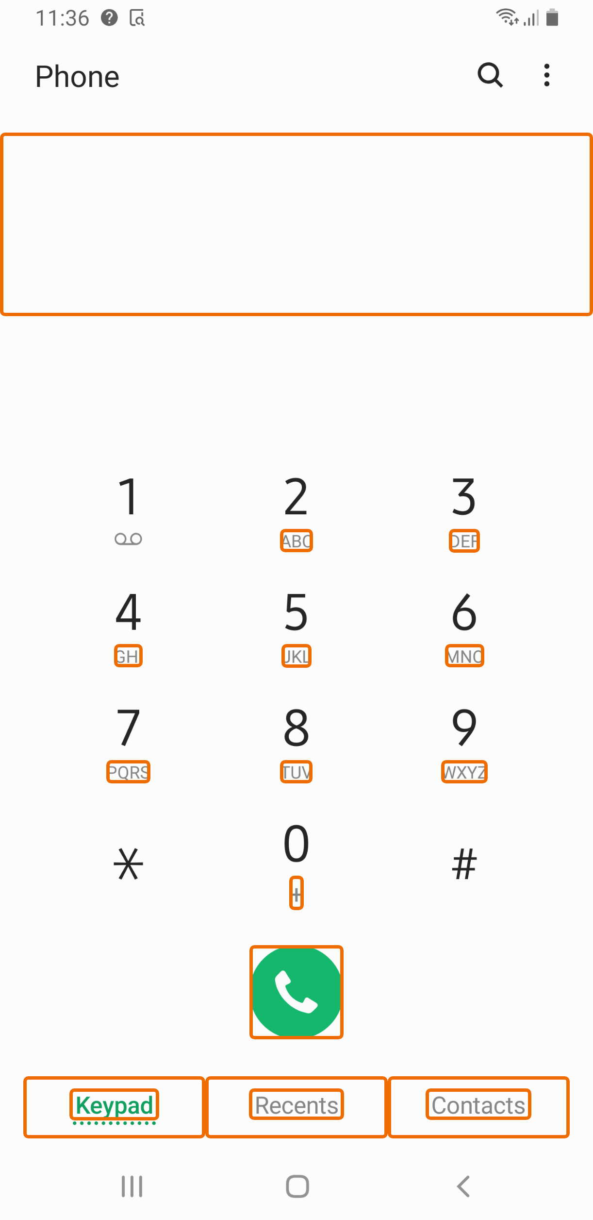
Sample audit results by Accessibilty Scanner
The following is a list of opportunities to improve the accessibility of Phone. Each item corresponds to an outlined area on the attached screenshot.

Item label
com.samsung.android.dialer:id/dialpad_spacer_view
This item may not have a label readable by screen readers.

Touch target
com.samsung.android.dialer:id/dialpad_tab_button
This item's height is 43dp. Consider making the height of this touch target 48dp or larger.

Touch target
com.samsung.android.dialer:id/calllog_tab_button
This item's height is 43dp. Consider making the height of this touch target 48dp or larger.

Touch target
com.samsung.android.dialer:id/contactlist_tab_button
This item's height is 43dp. Consider making the height of this touch target 48dp or larger.

Item type label
com.samsung.android.dialer:id/dialButton
This item's android:contentDescription, "Call button" ends with the item's type.

Text contrast
com.samsung.android.dialer:id/dialpad_key_letters
The item's text contrast ratio is 3.60. This ratio is based on an estimated foreground color of #858585 and an estimated background color of #FCFCFC. Consider using a contrast ratio greater than 4.50 for small text, or 3.00 for large text.

Text contrast
com.samsung.android.dialer:id/tab_text_view
The item's text contrast ratio is 3.33. This ratio is based on an estimated foreground color of #109F5E and an estimated background color of #FCFCFC. Consider using a contrast ratio greater than 4.50 for small text, or 3.00 for large text.

Text contrast
com.samsung.android.dialer:id/tab_text_view
The item's text contrast ratio is 3.60. This ratio is based on an estimated foreground color of #858585 and an estimated background color of #FCFCFC. Consider using a contrast ratio greater than 4.50 for small text, or 3.00 for large text.

Text contrast
com.samsung.android.dialer:id/tab_text_view
The item's text contrast ratio is 3.60. This ratio is based on an estimated foreground color of #858585 and an estimated background color of #FCFCFC. Consider using a contrast ratio greater than 4.50 for small text, or 3.00 for large text.
Step-by-step instructions
Watch this short video to learn how you can enrich your test reports with audit results produced by Accessibility Inspector or Accessibility Scanner or review the instructions following the video. The video shows how to download the report as a .zip file and open it in a browser window.
For each screen to audit, add the mobile:checkAccessibility:audit function to your test script, as follows:
//declare the Map for script parameters
Map<String, Object> params = new HashMap<>();

params.put("tag", "<tag-name>");
driver.executeScript("mobile:checkAccessibility:audit", params);
where <tag-name> is a descriptive string to be used as the name of the audit result file. Best practice is to use the name of the audited screen as the tag name.
- In the Perfecto UI at <your-cloud>.app.perfectomobile.com (where your-cloud is your actual cloud name, such as mobilecloud), click Analyze reports.
- In the Test Analysis view, on the Report Library tab, click the report to which you attached the accessibility results.
The report opens. - At the top right, click the download icon
 .
. - From the download menu, select Accessibility. If more than one accessibility audit is available, select the required report.
- When the report has finished downloading the .zip file that includes the report in HTML format, extract the file and open it.
Also in this section