The biggest challenge in testing responsive web pages is UI tests on different resources (browsers and mobile devices). For a strong environment for testing responsive webpages, you can connect between Galen Framework, a powerful option for UI testing, and Perfecto. Perfecto provides access to thousands of real devices with different screen sizes and resolutions all through the cloud. Together with Perfecto, Galen Framework offers you with rich functionality for visual testing, such as image comparison and color scheme verification.
Galen Framework is an open-source framework that allows you to execute automated "look and feel" tests on responsive webpages. It is based on Selenium RemoteWebDriver and validates the UI location based on DOM data. Perfecto supports RemoteWebDriver and an implemented SeleniumGrid protocol.
Learn how to execute Galen tests on mobile devices in Perfecto using RemoteWebDriver. For information on integrating Galen with Perfecto Smart Reporting, see Integrate Galen Framework with Smart Reporting.
Galen provides a simple scripting language to create an automated test and to define validations based on UI objects. In this example, we selected The Paint Drop as a responsive webpage to test. The following images show the webpage on web and on mobile.


 Step 1 | Define the objects
First, let's define all objects at the beginning of the test (spec file). We will use these objects as part of our test.
=========================================
logo               xpath  //h1 [@class='logo']
search             xpath  //*[@id='q']
searchButton       xpath //*[@class='icon-search']
header             xpath .//*[@class='utility']
menu               xpath .//*[@class='header-main']
item1              xpath (//*[@ class="accordionToStandalone-inner"])[1]
item2              xpath (//*[@ class="accordionToStandalone-inner"])[2]
item3              xpath (//*[@ class="accordionToStandalone-inner"])[3]
=========================================We start with the following validations:
- All - should be executed on all the devices.
- Desktop - should be executed only on desktop.
- Mobile - should be executed on mobile devices.
Following are validation examples.
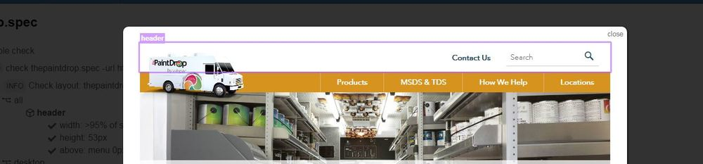
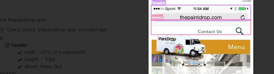
Header validation
Let's validate the header's location on the screen. Its width is almost full-screen size. We also validate that it is located on top of the menu. This test is written on the "All area" and will be executed on devices and web.
header
    width: >95% of screen/width
    height: ~ 50px
    above: menu 0px
The following images show the header validation results on web and on mobile.
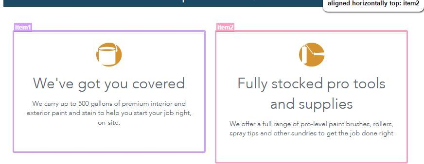
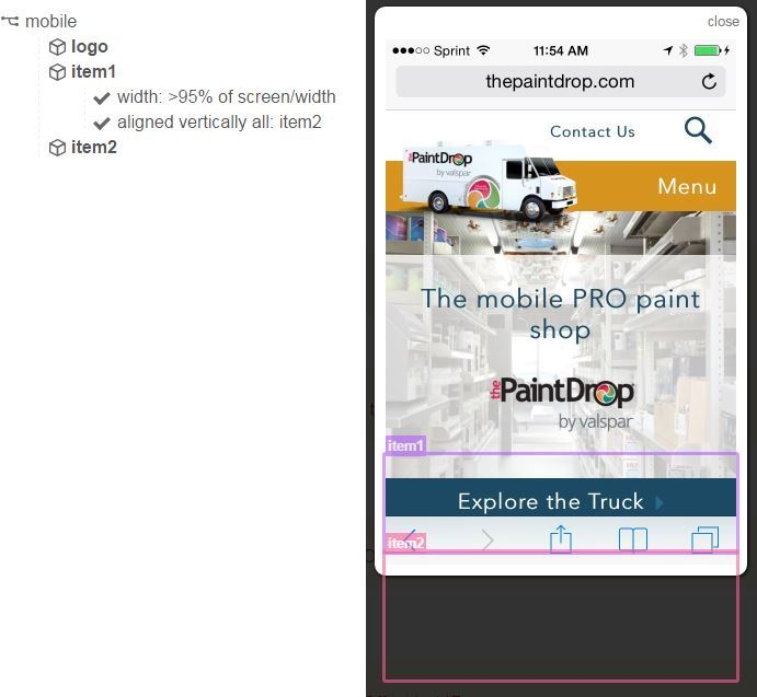
All-items-aligned validation
In this responsive webpage, the items' locations changed based on the screen size. Let's add two validations: one for web (the items should be aligned horizontally) and one for mobile (the same items should be aligned vertically).
@desktop
item1
    aligned horizontally top: item2
item2
    aligned horizontally top: item3
@mobile
item1
    aligned vertically all: item2
item2
   aligned vertically all: item3
The following images show items aligned on web and on mobile.
Step 3 | Test execution
Local Execution: There are few ways to execute Galen. Let's generate a standard config file from the command line.
galen configThen we execute the test by using the following command:
galen.bat check thepaintdrop.spec -url http://thepaintdrop.com/ --size "940x680" --htmlreport c:\Users\uzie\dev\galen-bin-1.6.3\demo\rep --include desktop,allThis command is executed in the Galen test on your local PC and opened in a local browser.
Grid execution
To execute the test on devices in the Perfecto cloud, we create a .test file. This file contains the following parts:
- @@set - list of the parameters like cloud, user and password
- @@ table browsers - table includes the browser name and the relevant capabilities
- @@parameters using browsers - parameters for the execution
@@ set
    user            [Cloud User Name]
    password        [Cloud Password]
    gridLogin       ${user}:${password}
    gridUrl             https://${gridLogin}@perfectomobile.com/nexperience/wd/hub
    website         http://thepaintdrop.com/


@@ table browsers
    | browserName   | gridArgs                                                 |
    | mobileOS     | --browser "mobileOS"  --user "user"  --password "password" --deviceName "deviceID"             |
    | mobileOS     | --browser "mobileOS"  --user "user"  --password "password" --deviceName "deviceID"    |


@@ parameterized using browsers
Home page on ${browserName} browser
    selenium grid ${gridUrl} --page ${website} ${gridArgs}
        check thepaintdrop.spec
Using the following command, we then execute it via Perfecto for the devices we defined in the .test file above.
galen test crossDevices.test --htmlreport c:\Users\uzie\dev\galen-bin-1.6.3\demo\repMobile --include mobile,all The full spec file:
@all
header
    width: >95% of screen/width
    height: ~ 50px
    above: menu 0px
@ desktop
logo
    height: 100 px
    width: ~190 px
item1
    aligned horizontally top: item2
item2
    aligned horizontally top: item3
@ mobile
logo
    height: 92 px
item1
    width: >95% of screen/width
item1
    aligned vertically all: item2
item2
   aligned vertically all: item3


